Work
Arc'teryx

Conquering the mobile eCommerce summit

Project Focus
Tech advisory and engineering
Data intelligence
Arc’teryx is a high-performance outdoor equipment company, renowned for leading innovations in climbing, skiing, and alpine technologies. The company wanted to extend their innovative advancements into the digital world.


Project overview
Challenge
Arc’teryx wanted a modern mobile app that would deliver an engaging and conversion-focused digital experience, even in low connectivity areas. They also wanted to improve their data and analytics capabilities.
Solution
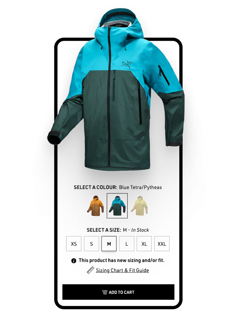
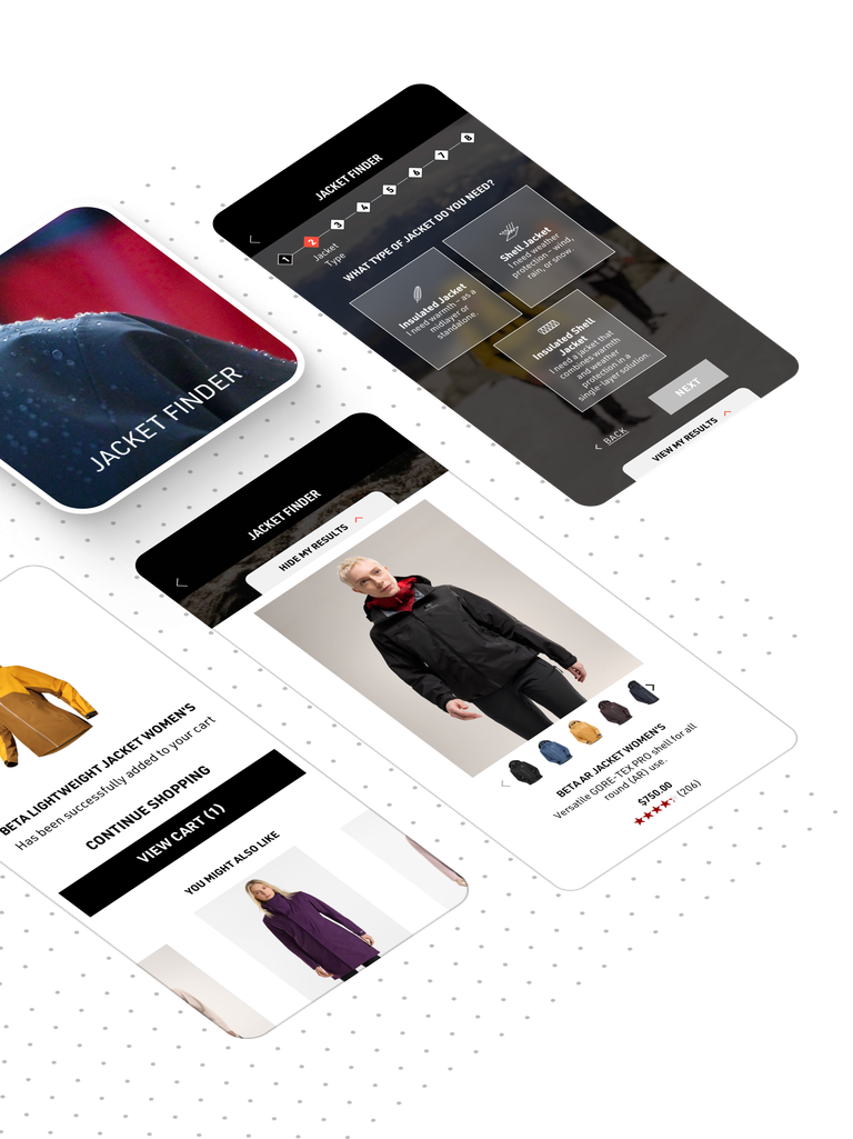
Our team created a rich, intuitive mobile app UX that allows customers to easily find products and make decisions, while unifying the visual feel across the website and mobile app to create a seamless experience.
Technology Partners:

Key Results
A mobile-first eCommerce experience that boosted conversions and orders, reduced app downtime, and increased the number of daily users.
+ 39 %
in sales conversions+ 29 %
in orders from the appWe’ve seen quite a bit of success with this app, so we’re excited to have this additional channel to carry forward our bigger, long-term goals.
Making the mobile experience simple, fast, and intuitive
Challenge
Arc’teryx wanted a new mobile app that would satisfy their users all over the world, from the backcountry to the boardroom. To position the company as a mobile-first eCommerce leader, the new Arc’teryx mobile app needed to deliver a seamless UX, even in areas with lower connectivity.


Developing a multi-year platform strategy and roadmap
Solution
Stretching across disciplines, our teams collaborated closely on delivering an enhanced commerce experience. We improved the mobile UX to create a visually rich and engaging interface and introduced new features to give customers a quick and easy way to make decisions. Visual narratives were created to connect the customer experience across the website and mobile app. We built the app using React Native, and made content blocks easy to edit and enhance with articles, videos, and a customizable news feed. Advanced functions including search, geolocation maps, and a sales portal were added, and users can now upload photos via the app to engage with the wider community.
Increasing conversions, orders, daily active users
Results
The new Arc’teryx mobile app delivered:
+ 39 %
in sales conversions+ 29 %
in orders from the app+ 8 %
in daily active users (DAU)s- 59 %
reduction in app uninstalls- 16 %
crash rate reduced+ 8 %
increase in repeat visitors


Partner with us
Together, we can deliver innovative solutions and drive your digital change journey.
Let's connect
+ 180 %
